Designing the right business logo
Logos are often the first thing that comes to mind when you think of a brand.
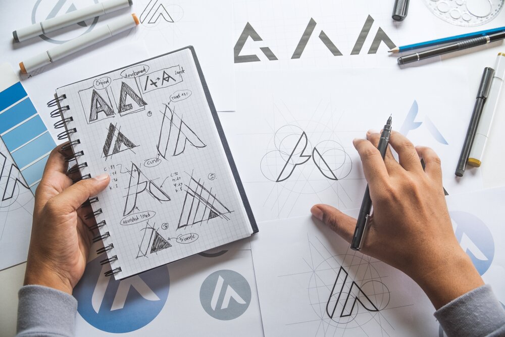
Corporate image is at the heart of any successful business. Therefore, making a positive imprint is vital. Planning and developing a logo can be an exciting endeavour for new businesses, however it’s important to do your homework before beginning your design. It’s best to start with evaluating the values, ethos and target audience for your business. When you’ve done the back work, then you can drive towards a logo design that lands right for your business in the marketplace.
This article will breakdown the theory behind logo design, helping you gain a better understanding of how to approach the design of your next logo.
Logos are generally divided into four main groups:
Wordmarks
The first and most basic logo is the text symbol, otherwise known as a “wordmark.” A wordmark displays the name of a company. The most recognisable and clear example of a wordmark is, Google. We here at Franchsing.eu also use a wordmark for our company logo. Often companies use abbreviated or a shortened “nickname” of the company to define themselves. Coca-Cola is a wordmark that also uses the shortened version of their name, “Coke,” in many of their marketing, advertisements and products. The likes of IBM, BBC and KFC all use acronyms to streamline the brand name and image.
Fonts are crucial in conveying subtle messaging. For example, colourful names often mean friendly and fun. Bold fonts indicate strength and reassurance. Whereas cursive fonts may communicate class and sophistication. The overall advantage of a brand using a wordmark logo is that it’s easy to identify and remember.
Pictorial marks
The second group of logos are defined as “pictorials marks.” Otherwise known as brand marks or logo symbols, pictorial marks put simply are a graphic based brand logo. Clear examples of a pictorial logo are the Apple technologies apple with the bite, the McDonald’s golden arches, the windows of Microsoft and the green robot of Android. These logos are unmistakable and draw your attention exactly to the type and function of the brand. Brand marks do unfortunately rely on some level of brand recognition to be widely effective; however, in turn, brand marks are widely beneficial for multi-national corporations who use the pictorial marks to define their business across borders, languages and different cultures.
Abstract marks
The third type of logos are “abstract marks.” These logos go a step beyond pictorials, which in essence relays the brand name in the design. An abstract logo takes a geometric form and has the ability to reflect and covey a feeling, meaning or emotion of the brand. Some examples are the tri-point star of Mercedes – representing land, air and sea, and the Olympic rings – representing each continent and flag colour of the world. But not all successful abstract logos are perfectly geometric.
The swoosh of Nike, was designed in homage to the winged goddess of victory and is said to represent the arc of movement. The Nike brand logo, as successful as it is today, was initially met with criticism at the time of conception.
Nike's iconic logo was designed by student graphic designer, Carolyn Davidson in 1973. At the time, Nike founder, Phil Knight, wasn’t too sure about the design, but as they were running out of time to find the perfect logo they thought “it will do.” The designer received a whole 35 dollars for the logo. Due to its worldwide success, Davidson was further honoured for her design in 1983, when the designer was gifted a special ring and 500 Nike shares.
Emblems
The fourth group of logos is the “emblem.” An emblem consists of text encased in a symbol or crest. The best way to visualise this would be your school/university crest, or your favourite sports team’s logo. The best example in business would be the Starbucks Coffee mermaid emblem. Another iconic logo in this category is the Harley Davidson Motorcycles crest. While these styles of logos can look timeless, standing proud with text and design, if overdone they can often come across as cluttered – especially when they are shrunk down for a business card or embroidered onto a uniform.
Other logos
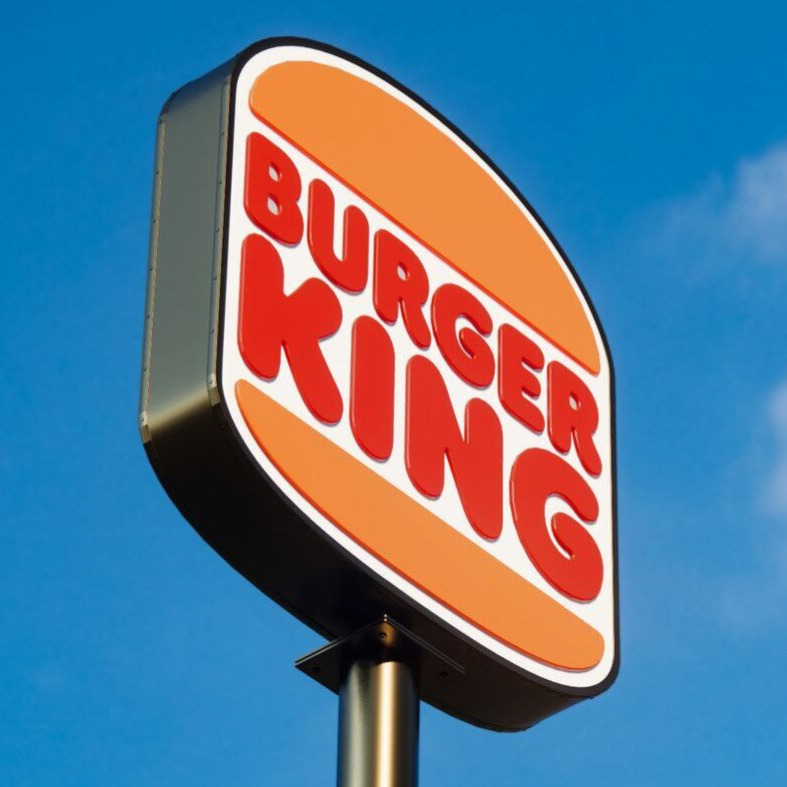
These four groups of logos are not absolute or mutually exclusive. Other types and styles do exist. You can also use a combination mark which is a mixture of wordmark and pictorial logos. An example of this can be found in Burger King’s logo of the company’s name wedged between burger buns. At the end of the day, you must be diligent with your research, calculating what is right for your business and what best represents your audience. Don’t be afraid to test out a few different designs and get feedback before making your final decision… unless you run out of time like Nike.

Shopping cart
Added to your shopping cart
Breaking news
Show all
L'Onglerie franchise
A leading French beauty franchise offering a proven salon concept, comprehensive training, and long-term opportunities in the nail care industry.
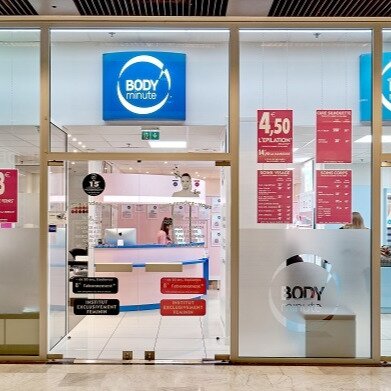
Bodyminute franchise
A leading beauty franchise offering an accessible business model, recurring customer revenue, and comprehensive support for entrepreneurs.
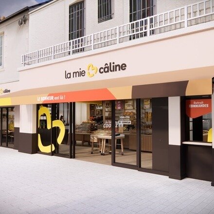
La Mie Câline franchise
A leading French bakery franchise offering entrepreneurs a proven concept, strong brand recognition, and opportunities in the growing food service...

GreenThumb franchise
A proven lawn care franchise offering entrepreneurs a scalable business model, strong brand support, and opportunities in the growing garden...